Statistical Process Control (SPC)
What gets measured gets managed – Peter Drucker
This is incredibly relevant to the topic at hand – Statistical Process Control (SPC).
Statistical Process Control (SPC) is a collection of tools that allow a Six Sigma specialist to ensure that their process is in control, using statistics 😊.
The most common SPC tool is the control chart which is our focus of this chapter.
Objectives & Benefits of SPC and Control Charts
SPC was born in the 1920’s when Walter Shewhart developed the first control charts. Since then, many other quality gurus have expanded on these early control charts to give us what we have today.
In general, SPC is a collection of tools and techniques used to measure and analyze process data in order to characterize the behavior of our process and achieve process control.
The most common SPC tool is the control chart, which will be the focus of this chapter. In simple terms, a control chart tool is a mirror that reflects the performance & behavior of your process. A control chart can also be described as a visual communication tool that graphs analyzed data in real-time.
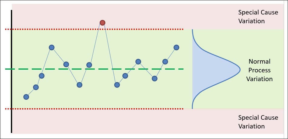
Primary Benefits of Control Charts
Ok, so let’s jump into the primary benefit of a control chart.
As you know, a control chart is used to reflect the performance of a process, and the performance of a process can be described by the average value of the process, and the variation associated with the process.
This is important – every process has natural variation that’s common to the process. This variation is caused by the natural and normal variation in the environment, the equipment, the facility, the people, etc.
There’s a second kind of variation that not natural to your process and this second kind of variation is not your friend!
This variation is often called special cause variation because it’s not common or natural to your process and can be attributed to a specific cause or problem (that should be eliminated 😊). When this type of variation is present – problems occur.
The primary benefit of a control chart is its unique ability to separate the normal variation within your process and the special cause variation.
Being able to distinguish between these two types of variability allows you to take action on your process only when necessary. Let’s jump into these two types of variation.
Secondary Benefits of Control Charts
One important secondary benefit of a control chart is the ability to measure the impact of improvement efforts. Within the DMAIC process is step 2, Measure, and step 5, Control. A control chart can be used in either steps of this process.
Another benefit of collecting data about your process over time is that it naturally facilitates the ability to measure the capability of your process.
Lastly, SPC can also be used in certain instances to begin to predict when problems will occur and prevent them.
For example, tool wear can cause a drift in a part dimension, which can be detected prior to it resulting in non-conforming material.
The Two Types of Variation within a Process
Let’s use an example to demonstrate these two types of variation.
Common Cause Variation
You’ve sampled from your process and found that it produces product that follows the normal distribution – by the way, this is a very important assumption for the use of a control chart – that your process follows the normal distribution.
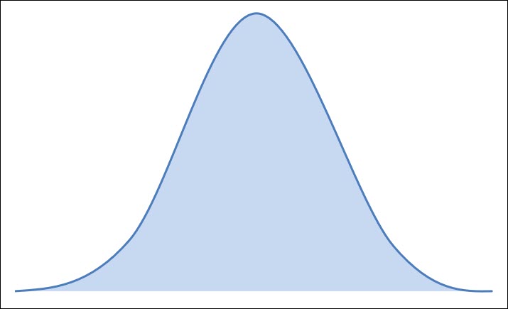
When a process is stable, it only experiences variation that is common, normal and inherent in the process. These common causes of variation cannot be eliminated without significantly redesigning the process.
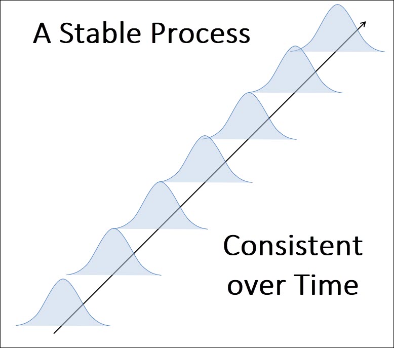
This is the ideal state for your process – this is the goal of SPC – to result in a consistent, predictable process over time.
Now, your stable process might have more variation that you’d want – and the only way to change that is to make a major change to your process to reduce the variation – this is the essence of six sigma.
When something goes wrong, it’s important to know if the issue is due to common cause variation or the second type of variation, special cause variation.
Special Cause Variation
Special cause variation is any type of variation that can be attributed to a special cause or situation that’s influencing your process. These special causes impact your process in negative ways and result in instability and unpredictability.
Perhaps one of your raw material vendors has sent you non-conforming material – this is special cause variation.
Perhaps a piece of equipment has blown a gasket and is acting up – this is special cause variation.
Special causes should be identified quickly and removed as they result in an unstable process over time:
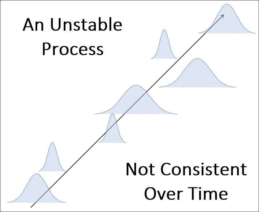
The primary benefit and purpose of a control is to help you identify when your process is being influenced by special causes of variation.
Being able to distinguish between common and special cause variation will also prevent you from over-reacting to common cause variation.
So how do we distinguish between normal variation and special cause variation – we use a control chart!
Let’s review the elements of a control chart so that you can see how a control chart distinguishes between common cause variation and special cause variation.
The Three Key Elements of a Control Chart
Below is a basic control chart, with its 3 key elements, the Center Line, the Upper Control Limit and the Lower Control Limit.
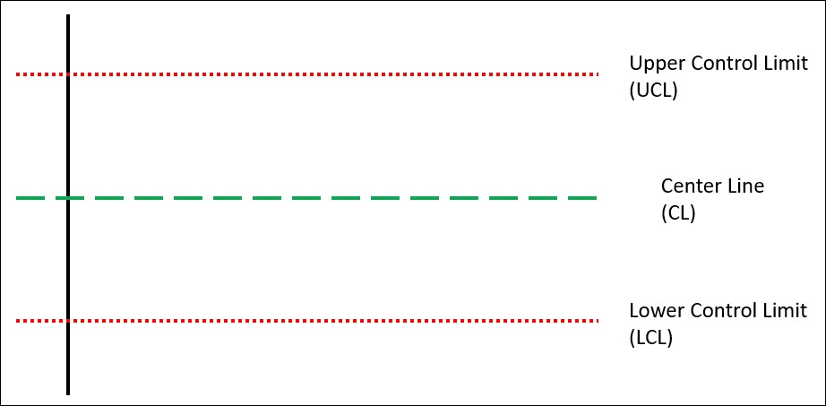
Whether you’re using attribute or variable data, all control charts will contain these 3 elements.
These 3 elements allow the control chart to distinguish between common cause variation and special cause variation.
The truly special elements of the control charts are the control limits, and these limits create the boundaries between common cause variation and special cause variation.

Typically, these control limits are set at +/- 3 standard deviations away from the average value (center of the process). Thus, if your process is stable (not changing over time), then 99.73% of your population should fall within the control limits.
It is very important to note that these elements of the control chart (Centerline & Control Limits) are not associated with your specification limits or customer requirements.
These control limits and centerline represent the “voice of the process” and are simply a reflection of the process – both the average value of your process and the natural variation of the process.
These control limits do not reflect the “voice of the customer” – meaning that they have nothing to do with your specification limits.
Let’s now discuss how to create a control chart.
Selection of Variables
When creating a control chart, the first factor you must consider is which variable within your process will be controlled, and what type of data is available for that process variable.
Regarding the type of data – we will review the difference between continuous and discrete data below as this will determine the type of control chart you should use.
Continuous vs. Discrete data
Discrete data is any data that is limited to a specific range of data and cannot be more precise. Discrete data usually involves whole integers (1, 2, 3, 4); or can often simply be pass/fail or good/bad assessments.
Discrete data includes things like the number of defects per lot, Pass/Fail data, True/False data, the count conforming/non-conforming product, the number of defectives per Lot, etc.
You may also see discrete data called attribute data or counted data.
Continuous Data is any data set that can be measured across a wide scale and can be reduced to finer & finer results. The height of the table is 38.2840 inches. The TV has been on for the last 1,458.79 seconds.
So continuous data can take any value on the real number line while discrete data can only take on limited values.
If you’re using discrete data, you’re going to have to determine if you’re measuring defects or defectives. Let’s discuss this now.
Defect vs. Defective
A defect and a defective are not the same thing – not by a long shot.
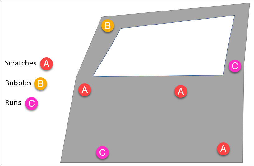
A “defective” is an entire unit that fails to meet specifications. A “defect” is an undesirable condition within a unit.
If a unit has a defect on it, it is defective, however a single defective unit can have multiple defects associated with it.
Below is a car door that’s been inspected for defects – scratches, paint runs, paint bubbles. This single car door is a “defective unit” that could be trended, or each individual defect (scratches, paint runs, paint bubbles) can be trended.
Using the Pareto Principle to Select a Variable to Control
There are a few factors to consider when determining the critical few parameters to control chart:
- the correlation between that variable and the process, (is it a key process variable)
- the criticality of the variable in terms of risk to the customer or product functionality,
- the potential financial benefits or consequences associated with a variable,
- the difficulty associated with implementing and maintain a control chart.
Another common recommendation is to pick a variable that is upstream in your process so that you detect the special cause variation early.
The Process Design phase is the perfect time to identify these key process variables that should be control charted.
Types of Control Charts
Variable Control Charts
Let’s start with top 3 variable control charts:
- X-bar & R Chart
- X-Bar & S chart
- I-MR chart
Variable control charts always work in pairs, with the first chart monitoring the process average, and the second chart monitoring the process variability.
For example, the X-bar chart monitors the central tendency of your process. The Individuals (I) Chart is also a representation of the central tendency of your process.
Similarly, the R (Range) Chart, S (Standard Deviation) Chart and the MR (Moving Range) Chart all reflect the variability in your process.
How to Choose the Right Variable Control Chart
When deciding which control chart to use, the one factor to consider is the sample size of the rational sub-group.
If you’re rational sub-group size is a single value (1), then you’ll use the I-MR (Individual and Moving Range) Chart.
If you’re rational sub-group size is between 2 – 10, then you’ll use the X-Bar and R Chart. When the sample size is less than 10, the Range of the sample data is a better estimator of the process variability than the standard deviation.
If you’re rational sub-group size is greater than 10, then you’ll use the X-Bar and S Chart. When you’ve got 10 or more samples in a rational sub-group, then the best estimator of the process variability is the standard deviation.
Attribute Control Charts
There are 4 control charts for attribute (Discrete) data:
- C Chart
- U Chart
- P Chart
- NP Chart
Unlike variable control charts, these discrete data control charts are only a single chart. It’s not like the X-bar and R chart where there’s two charts, one for the average and the other for the variance. With discrete data it’s a single chart.
A quick general comment, attribute control charts are normally easier to construct and execute, however they tend to be less sensitive to small changes in variation or process shifts.
How to Choose the Right Attribute Control Chart
The first big distinction between these four charts is the whole defect vs. defective discussion from above.
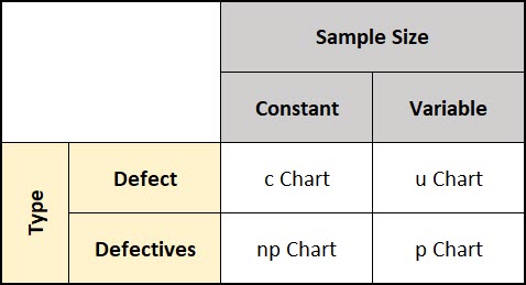
The c chart & u charts analyze defects over time, while the p chart & np chart analyze defectives over time.
The second big distinction between these four charts is the sample size associated with the control chart and whether that sample size is constant or variable.
When the sample size is constant between subgroups we use the c chart & np chart and the math is much easier. When the sample size varies we use the p chart and the u chart and the math gets a bit more difficult.
You can see this in the matrix below.
Let’s review each chart type individually.
- P Chart: Trending of Defectives with a Variable Sample Size
- NP Chart: Trending of Defectives with a Constant Sample Size
- U Chart: Trending of Defects with a Variable Sample Size
- C Chart: Trending of Defects with a Constant Sample Size
np & p Charts trend the number of Defectives and the math is based on the Binomial distribution which operates under the assumption that every unit inspected can only be counted as “bad” one time.
u & c Charts utilize the Poisson distribution because they trend the number of defects where it is possible for each item inspected to contain multiple defects.
Analyzing & Interpreting Control Charts
Remember, the overall goal of a control chart is to help you in identifying special causes of variation, and ultimately improving your process for better performance.
Let’s review the 8 rules that can be used to determine if a process is in a state of statistical control.
The 8 Rules for Statistical Process Control
Ok, so let’s assume you’ve picked a control chart, and you’re monitoring that data, now it’s time to analyze the data to make sure your process is in control.
Before we review the rules, you have to understand the different zones of a control chart. These zones are created utilizing the standard deviation of your data:
- Zone C is the area between the centerline (process average) and the 1st standard deviation
- Zone B is the area between the 1st standard deviation and 2nd standard deviation
- Zone A is the area between the 2nd standard deviation and 3rd standard deviation
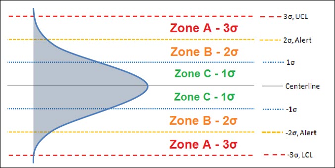
Utilizing these Zones, we’re able to create rules to identify special causes of variation:
- Rule 1 – Any single data point outside of either the upper or lower control limits (>3σ) – outside Zone A.
- Rule 2 – Two out of three consecutive data points in Zone A (same side) – greater than 2σ, but less than 3σ.
- Rule 3 – Four out of Five consecutive data points in Zone B (same side) – greater than 1σ, but less than 2σ.
- Rule 4 – Eight or more consecutive points on either side of the Centerline –a run
- Rule 5 – Six points in a row, all increasing or decreasing – a trend
- Rule 6 – 14 points in a row, alternating up and down – systematic variation
- Rule 7 – 15 points in a row within Zone C (<1σ) – to little variation
- Rule 8 – 8 points in a row outside of Zone C (>1σ) on either side
Violating any one of these rules can be a strong indication that your process is under the influence of a special cause variation and that further investigation is needed.